Why Your Loading Spinner Is Teaching Users to Quit
Loading spinners train users to quit—learn why they damage trust and how to fix the friction
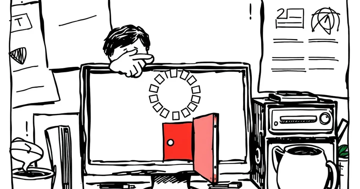
You just spent three seconds staring at a spinning wheel. That’s enough time for your brain to decide this website isn’t worth it. But here’s the kicker: you probably blamed yourself for having slow internet, not the designer who put that spinner there.
That spinning icon isn't neutral. It’s a silent teacher. Every time it appears, it’s training your users to expect friction, to doubt your reliability, and eventually, to click away.
The Spinner Is a Promise You Break
A loading spinner tells the user one thing: "Wait." But you haven't earned their patience. You're asking for trust you haven't built yet. When someone lands on your site, they have zero emotional investment in you. They are evaluating you.
Imagine walking into a coffee shop and standing at the counter for 15 seconds while the barista stares at a machine. You’d walk out. That spinner is the digital equivalent of that awkward silence. It signals that your system is working on the user, not for them.
The 3-Second Rule (And Why It Matters)
I run a small e-commerce store for handmade pottery. Last year, my product images were high-res and slow. My checkout page had a spinner that showed for about four seconds while it calculated shipping. My cart abandonment rate was 78%.
I changed two things:
- I compressed every image to under 100KB.
- I removed the spinner entirely and showed a static "Calculating..." text instead.
The abandonment rate dropped to 54% in two weeks. The spinner wasn't just slow—it was a signal of unreliability. Users interpreted that four-second wait as "this site is broken."
What the Research Says
Studies from Google and Amazon show that a one-second delay in mobile load times can reduce conversions by up to 20%. But the hidden cost is worse: users form a negative brand association in under three seconds. That spinner is teaching them that your brand is slow before they even see your product.
When a Spinner Is Actually Useful
I’m not saying spinners are always evil. There are two scenarios where they make sense:
- Background tasks that take longer than 5 seconds (like uploading a large video file). Here, you need a progress bar, not a spinner. A spinner with no percentage tells the user nothing.
- When the user triggered an action they expect to be slow (like "Generate Report"). In that case, show a spinner but also show what’s happening: "Gathering data from 2,000 orders..."
If your spinner is just covering up a slow API call or a bloated homepage, you’re using it as a crutch.
The Real Fix: Never Let Them Wait for Nothing
The best loading state is no loading state. Here are three practical moves:
- Skeleton screens. Show the layout of the page immediately, then fill in content. The user’s brain registers progress, not waiting.
- Instant feedback. If a button click triggers an action, change the button state immediately (grey it out, show a checkmark). Don't let the user wonder if they clicked correctly.
- Optimize the critical path. Identify the one thing the user needs to see first (headline, hero image, CTA). Load that first. Everything else can load lazily.
The Takeaway
Your loading spinner is not a neutral design element. It’s a message. Every spin tells your user, "I don't respect your time." Next time you build a page, remove the spinner and replace it with something that feels like progress. Your user won’t thank you—they’ll just stay. And that’s the whole point.
— creative mess