Why Your Floating Action Button Hides Your Primary Call to Action
A floating action button can quietly steal clicks from your main CTA—here’s how to spot the conflict and reclaim conversions
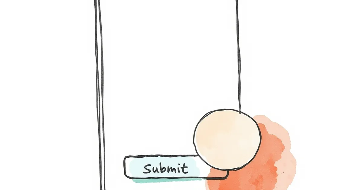
You’ve spent hours polishing your product page, tweaking the hero image, and crafting the perfect button copy. So why is it that your users keep tapping that little circular icon in the corner instead of the big, beautiful CTA you placed right in their line of sight?
The floating action button (FAB) is a sneaky thief. It was designed for convenience, but in many interfaces, it actively competes with—and often beats—your primary conversion goal. Let’s break down why that happens and how to fix it before your analytics cry.
The Psychology of the Shiny Circle
We are wired to notice movement and contrast. The FAB, with its elevated shadow, vibrant color, and permanent position, is the loudest kid in the classroom. Your primary CTA, sitting statically in a header or above the fold, is the polite student raising a hand.
The FAB wins attention because it feels interactive before you even touch it. It promises a quick action, usually something like "chat" or "share." Meanwhile, your "Start Free Trial" button asks for commitment. Users subconsciously gravitate toward the low-effort option, even if it’s not what you want them to do.
The "Thumb Zone" Trap
Here’s a concrete example from a client I worked with last year. They ran a SaaS dashboard with a "New Project" FAB in the bottom-right corner. Their actual goal was to get users to invite team members, a button placed in the top navigation.
Mobile analytics showed a 40% tap rate on the FAB and a 4% tap rate on the invite button. Why? Because the FAB sat right in the natural thumb arc. Users didn’t choose the FAB over the other option; they simply didn’t see the other option because their thumb never travels that high.
When a FAB Becomes a Visual Anchor
The problem isn’t just about thumb placement. It’s about visual hierarchy. A FAB is essentially a secondary action wearing a primary action’s clothes.
If your main CTA is a standard rectangular button, it will almost always lose against a circular, floating element. The FAB breaks the grid, casts a shadow, and hovers above the content. It creates a sense of urgency that your in-flow button simply cannot match.
The "Chat With Us" Paradox
The most common offender is the chat widget FAB. It’s great for support, but it’s terrible for conversion. Every second a user spends typing "Do you offer discounts?" is a second they are not clicking "Buy Now."
I’ve seen countless landing pages where the "Buy" button is bright green, but the chat bubble is a pulsing blue circle with a notification badge. Guess which one gets clicked? The badge triggers a fear of missing out (FOMO). Your primary CTA doesn’t have a badge, so it feels optional.
How to Reclaim Your Conversion Path
You don’t have to kill the FAB entirely. You just need to demote it. The goal is to make sure your primary CTA is the only floating, high-contrast element on the screen.
- Move the FAB away from the action. Place it in a corner that’s not in the natural reading path, like the bottom-left for left-to-right languages.
- Change its color to match the background. A gray or ghost-style FAB won’t scream for attention.
- Delay its appearance. Only show the FAB after the user scrolls past the main CTA. This ensures they’ve had a chance to commit first.
The "Action Hierarchy" Rule
If your primary goal is a signup, then nothing should float. If your primary goal is engagement (like a feed post), then a FAB for "Create" is fine. The rule is simple: One floating element per screen, and it must serve the business goal, not the user’s convenience.
The Future Is Contextual
Looking ahead, I see more interfaces ditching the permanent FAB for contextual menus that appear based on scroll depth or user behavior. This is a good thing. A button that appears when you need it is more effective than one that always hovers, nagging for attention.
Your design should guide, not compete. So take a hard look at your mobile layout. If there’s a circle in the corner, ask yourself: Is this helping me sell, or is it just a shiny distraction? If it’s the latter, move it or lose it. Your conversion rate will thank you.
— creative mess