Why Your Achievement Badge’s Lock Icon Teaches Users to Quit
A tiny lock icon on achievement badges may be training users to give up before they even start
Why Your Achievement Badge’s Lock Icon Teaches Users to Quit
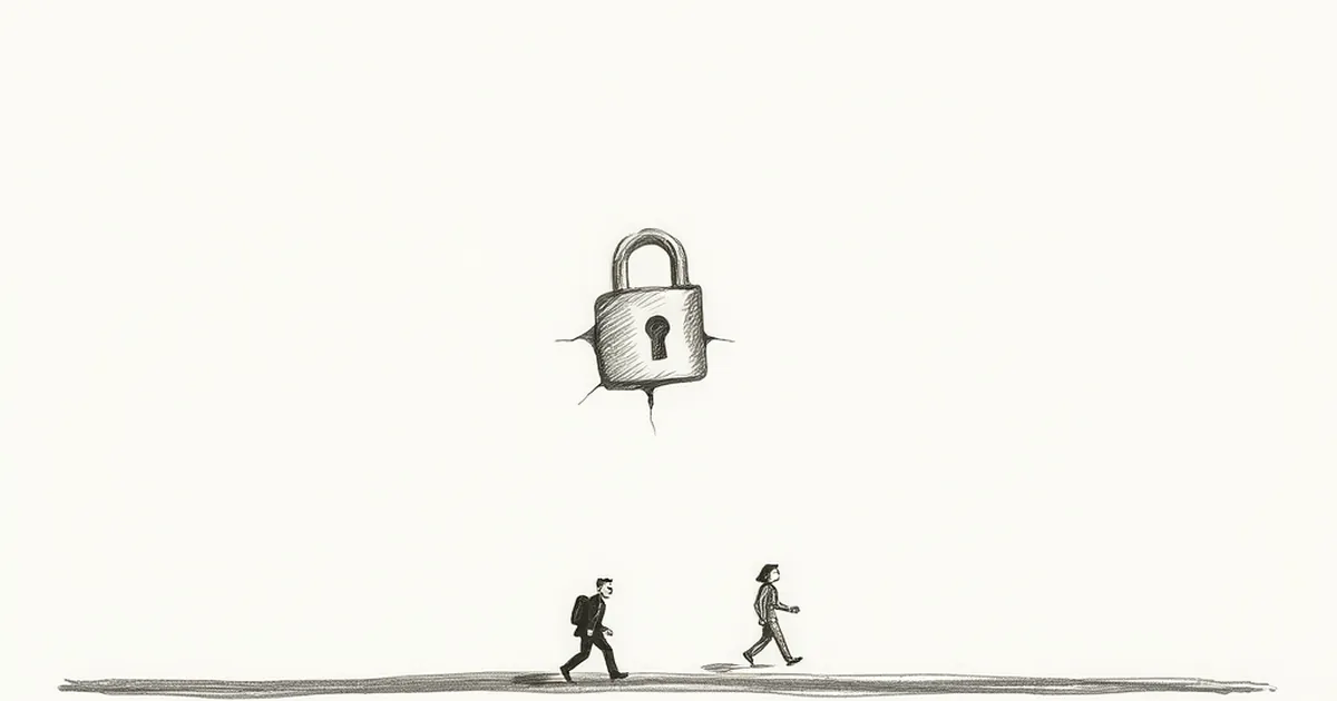
It’s a tiny detail, almost invisible in a mockup: the greyed-out badge with a padlock overlay. You’ve designed it to signal “unlockable,” a goal the user should chase. But what if that lock icon, in the context of a business website, is actually training your users to stop trying? Behavioral psychology suggests the difference between a locked badge and an empty slot isn’t just visual—it’s a lesson in helplessness versus hope.
The Psychology of the Empty Slot vs. the Lock
The Allure of the Unknown
Think about a progress bar or a row of empty circles. Those voids are invitations. Your brain releases a small pulse of dopamine just anticipating the reward of filling them. This is the Zeigarnik Effect in action: we remember incomplete tasks better than completed ones, and our brain nags us to finish them. An empty slot is a puzzle waiting to be solved.
The Lock as a Ceiling
Now replace that empty slot with a lock icon. Suddenly, the message shifts from “you can earn this” to “you cannot have this yet.” The lock introduces a threshold, a condition. For a user who hasn’t met that condition, the badge isn’t a goal—it’s a rejection. This taps into what psychologists call reactance: the motivational arousal we feel when our freedom is threatened. The lock doesn’t motivate; it frustrates.
The Study That Proves Locks Backfire
A well-known 2011 experiment by researchers at the University of Chicago and Stanford looked at goal gradients in customer loyalty programs. They found that customers who were given a “head start” (e.g., two free stamps on a 10-stamp card) were far more likely to complete the card than those starting from zero. But crucially, they also tested a “locked” condition—a card that required a purchase before the stamps even started counting. Users in that locked group showed significantly lower persistence.
The lock icon on your achievement badge does the same thing. It tells the user: “You are not yet in the club.” Instead of creating a chase, it creates a barrier. For a business website, where every click counts, that barrier is a silent quit button.
Designing for Anticipation, Not Exclusion
Show the Shadow, Not the Lock
Instead of a padlock, use a ghosted or silhouette version of the badge. The outline is an invitation; the lock is a wall. A silhouette says “this shape is waiting for you,” while a lock says “you are not authorized.”
Reveal the Path, Not the Gate
If you must show an unearned state, pair it with a clear, low-friction action. For example, instead of a locked “Power User” badge, show a badge with a progress ring that fills as the user completes actions. The visual feedback loop (the ring filling) uses variable-ratio reinforcement—the user never knows exactly which action will push them over the threshold, making them more likely to keep trying.
A Forward-Looking, Practical Close
Next time you’re designing a gamified element for your business site—whether it’s a completion bar, a skill rating, or a milestone badge—ask yourself one question: Does this element invite action or impose a condition?
Replace locks with placeholders. Replace “Unavailable” with “Coming Soon.” Replace static grey with a dynamic progress indicator. Your users don’t need a reminder of what they can’t have; they need a gentle, visual nudge toward what they can achieve. The moment you stop teaching them to quit, you start teaching them to stay.
— creative mess